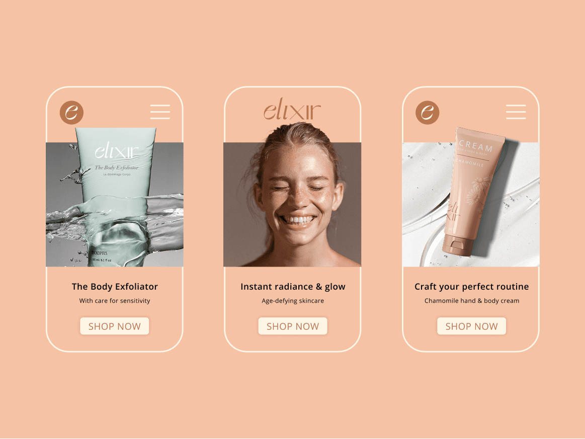
Elixir | Branding
WHAT DOES RADIANCE LOOK LIKE? FOR ELIXIR, I EXPLORED THAT IDEA THROUGH A VISUAL IDENTITY THAT BALANCES SOFTNESS WITH PRECISION, ELEGANCE WITH ENERGY, AND SKINCARE WITH SELF-EXPRESSION.
Client
Elixir
DELIVERABLES
BRAND IDENTITY · PACKAGING · ART DIRECTION
Year
2024
Role
Creative Direction
The Brief
Skincare that feels as good as it looks.
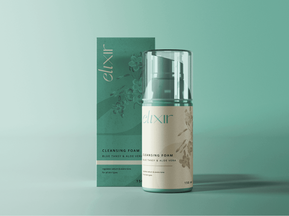
ELIXIR is a skincare brand built around the idea of radiance and rejuvenation, creating products that help people feel confident and comfortable in their own skin.
The challenge was to translate this philosophy into a visual identity that could feel- Elegant, contemporary, optimistic and approachable.
Rather than relying on the familiar visual language of clinical skincare, the identity needed to create a more distinctive balance between beauty and innovation.


The Mark
A mark that feels light, fluid and refined.
The identity takes cues from the idea of transformation, keeping the form simple enough to feel timeless, while giving it enough character to become recognisable.